How to Choose Trending Living Room Colors in 2026?

Time:2026-09-22 Author:Oliver
0%

Choosing a living room color in 2026 is less about copying a viral palette and more about understanding how color behaves at home. Natural light, flooring, furniture, and daily routines can change a shade dramatically. A soft green may feel calm beside oak, yet appear gray near cool window light. Even popular colors can disappoint when viewed only on a phone screen.

So, what is the trend for living room colors this year? Designers are increasingly balancing grounded neutrals with expressive accents. Warm whites, clay, muted blue, olive, and gentle brown are gaining attention because they create depth without overwhelming the room. However, trend reports should guide decisions, not control them. A color that looks refined in a showroom may feel flat beside your existing sofa.

This guide explores practical ways to select a stylish, livable palette for 2026. It considers room orientation, paint undertones, finish, furniture materials, and visual comfort. Test large samples on several walls. Observe them in morning light, cloudy weather, and evening lamp light. That small step often reveals more than a designer image.

There is no perfect formula.

Professional advice helps, but personal experience matters too. Families, pets, renters, and frequent entertainers need different levels of durability and warmth. You may also change your mind after living with a sample for a week. That is not failure; it is useful evidence. The strongest color choice usually feels current, practical, and genuinely connected to the people using the room.
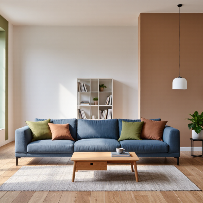
How to Choose Trending Living Room Colors in 2026?

Understanding the Key Living Room Color Trends for 2026

Living room color trends for 2026 are moving toward warmth, softness, and natural depth. Instead of stark white, designers are favoring mineral beige, muted olive, dusty blue, and gentle terracotta. These shades feel comfortable without making the room look flat. Warm neutrals are especially useful in spaces with limited sunlight. They can soften cool shadows from north-facing windows.

Light changes everything. I usually test large painted boards against the sofa, flooring, and curtains. I check them in the morning, afternoon, and evening. A color that looks calm at noon may appear gray after sunset. That detail is easy to miss.

Natural materials, such as oak, linen, stone, and woven fibers, also influence the final result. Olive green may feel elegant beside pale wood, but heavy beside dark furniture. Use the whole room, not just the wall.

A practical 2026 palette often combines one grounded main color with two quieter accents. For example, clay walls can work with cream upholstery and muted blue cushions. Keep glossy surfaces limited if you want a relaxed atmosphere. Matte finishes usually make rich colors appear more refined. I once chose a beautiful green that became gloomy across an entire room. A smaller feature wall would have worked better. Trends can guide your choices, but your room’s light, size, and daily use deserve more attention than a popular color chart.

Evaluating Room Size, Lighting, and Existing Interior Features

How to Choose Trending Living Room Colors in 2026?

Room size should guide color strength, not dictate it. In a compact living room, pale mineral green, soft blue-gray, or warm ivory can extend visual depth. Use one color across walls, trim, and ceiling for fewer stopping points. However, an all-white room may feel cold beside gray flooring. I have found that a small sample often looks calmer than the finished wall. Test it twice.

Lighting changes the result dramatically. The U.S. Department of Energy reports that daylighting can reduce electric lighting energy use by up to 75% in suitable spaces. Observe the room at 9 a.m., noon, and 7 p.m. North-facing windows may flatten warm clay or muted terracotta. South-facing rooms can intensify yellow undertones. According to ENERGY STAR, lighting represents about 15% of average household electricity use, so efficient layered lighting matters. Combine ceiling light, floor lamps, and low-level accent lighting. Keep color temperature consistent. It is easy to overlook.

Existing interior features deserve equal attention. Compare paint samples with wood grain, stone, rugs, metal finishes, and upholstery. The 2025 National Association of Realtors Remodeling Impact Report indicates that interior improvements remain closely linked to homeowner satisfaction, supporting a practical, livable approach over short-lived visual trends. Choose a trending hue only when it repeats a tone already present. A dusty green beside warm oak usually feels intentional. A fashionable blue beside orange wood may feel accidental. That mismatch can still work, but it needs testing.

How to Choose Trending Living Room Colors in 2026? — Evaluating Room Size, Lighting, and Existing Interior Features

Room Profile Typical Size Natural Light Existing Interior Features Recommended 2026 Color Direction Suggested Accent Colors Why It Works Overall Suitability
Compact urban living room Up to 180 sq. ft. / 17 m² Limited or north-facing light Low ceiling, small windows, light or medium wood flooring Warm white
Use a soft ivory or creamy off-white rather than a cool, stark white.
Soft sage, pale clay, light oak, muted brass Light warm neutrals reflect available light while reducing the visual heaviness of a small space. A low-contrast palette helps the room feel more continuous. Excellent
Compact room with strong afternoon sun Up to 180 sq. ft. / 17 m² Bright west-facing light White trim, pale flooring, reflective glass or metal surfaces Soft sage green
Choose a gray-leaning green with moderate saturation.
Mushroom beige, natural linen, matte black, muted terracotta A gentle green balances warm afternoon glare and adds color without making the room feel visually crowded. Matte finishes help control reflection. Excellent
Medium family living room 180–300 sq. ft. / 17–28 m² Balanced daylight from two or more windows Medium-tone wood, neutral sofa, simple architectural trim Mushroom taupe
Select a warm gray-beige with an understated earthy base.
Olive green, dusty blue, warm white, aged bronze Taupe connects wood, upholstery, and natural textiles. Its moderate value provides enough contrast for furniture while remaining adaptable as décor changes. Excellent
Large open-plan living area More than 300 sq. ft. / 28 m² Bright, even light throughout the day High ceiling, broad windows, open connection to kitchen or dining area Muted olive green
Use it on all walls or as a defined zone within the open plan.
Warm white, walnut brown, clay, brushed metal A medium-depth earth tone gives a large volume more intimacy and helps visually define the living zone without requiring a physical partition. Very good
Large room with dark architectural details More than 300 sq. ft. / 28 m² Moderate to bright daylight Dark beams, black-framed windows, stone fireplace, or dark built-ins Deep botanical green
Keep the finish soft or eggshell to avoid excessive glare.
Warm white, cognac leather, natural wood, aged brass A deep green visually supports existing dark features while adding an organic counterpoint. Warm accents prevent the scheme from feeling cold or overly formal. Very good
Room with a stone or brick fireplace 180–350 sq. ft. / 17–33 m² Variable daylight Red brick, beige limestone, gray stone, or a prominent mantel Muted clay terracotta
Use a softened, brown-based version rather than a highly saturated orange.
Warm white, olive, charcoal, natural fibers Clay tones repeat the warmth found in brick and many types of stone. Lower saturation keeps the fireplace visually dominant without competing with it. Very good
Room with cool gray flooring or cabinetry 180–300 sq. ft. / 17–28 m² North-facing or mixed artificial light Cool gray tile, concrete, silver metal, or blue-gray built-ins Dusty blue
Choose a desaturated blue with a slight gray undertone.
Warm ivory, pale wood, muted ochre, soft black A dusty blue harmonizes with cool existing surfaces without creating a monochromatic effect. Warm ivory and wood add the warmth that cool light often lacks. Good
Room dominated by warm wood furniture 180–300 sq. ft. / 17–28 m² Bright or balanced daylight Oak, walnut, teak, rattan, or other prominent wood elements Balanced warm white
Avoid overly yellow paint; choose a restrained creamy neutral.
Soft sage, dusty blue, charcoal, natural linen A quiet warm white allows the grain and tone of the wood to remain visible. Cool-neutral accents provide contrast without making the overall room feel stark. Excellent
Low-light room with few windows 180–300 sq. ft. / 17–28 m² Low daylight; primarily artificial lighting Dark upholstery, dark flooring, or enclosed layout Soft butter yellow
Use a muted yellow with a creamy, low-saturation appearance.
Warm white, pale wood, olive, aged brass A restrained yellow can make low daylight feel warmer and more welcoming. Testing under the room’s actual bulbs is essential because artificial light changes perceived color. Good
Feature-wall or color-zoned living room Any size Any lighting condition Alcove, fireplace wall, media unit, shelving, or clear architectural boundary Earthy clay or muted mineral tone
Apply it to one architectural feature rather than every wall.
Warm white, mushroom taupe, deep green, natural wood A focused color zone adds depth and supports spatial definition. Limiting the stronger color to one area reduces the risk of making the room feel smaller. Very good

Practical note: Color appearance changes with daylight direction, bulb color temperature, surface texture, and surrounding furnishings. Test large paint samples on multiple walls and observe them in morning, afternoon, and evening light before making a final selection.

Choosing Color Palettes That Match Different Design Styles

How to Choose Trending Living Room Colors in 2026?

Choose colors by design language, not by a single trend. For modern rooms, pair warm white with clay, olive, or muted charcoal. These shades soften sharp furniture and prevent the space from feeling sterile. Japandi interiors benefit from oat, sand, pale wood, and one black accent. Keep contrast gentle. For traditional rooms, try dusty blue, parchment, or deep green beside walnut furniture. Their quieter depth supports layered fabrics and older architectural details.

For biophilic or wellness-focused spaces, use moss, mineral blue, and sun-baked terracotta. The 2024 Global Wellness Economy Monitor valued the wellness economy at 6.3 trillion dollars in 2023. That figure reflects growing attention to restorative environments, although it does not prove that green walls improve wellbeing. The 2024 Trends Outlook from the American Society of Interior Designers also identifies nature-inspired materials and calming spaces as continuing priorities. Use those findings as direction, not a rigid formula.

Test colors beside your sofa, flooring, and evening lamps. I often paint two sample boards, then move them around the room for three days. Daylight changes everything. A popular beige may look pink at night. That happened in my own project. I still misjudge undertones sometimes. Small rooms can handle dark colors, but only with controlled lighting and reflective surfaces. Select one dominant color, one supporting shade, and a restrained accent. Too many “safe” neutrals can feel unfinished.

Balancing Base Colors, Accent Shades, and Decorative Details

How to Choose Trending Living Room Colors in 2026?

Balancing Base Colors, Accent Shades, and Decorative Details

Choosing a living room palette begins with the base color. In 2026, warm mineral neutrals, muted greens, and soft clay tones feel especially adaptable. I recommend testing large paint samples beside windows, flooring, and upholstery. Artificial light can change beige into yellow or gray within hours. Do not trust a tiny color card.

Keep the base quiet enough to support daily life. Then introduce one confident accent shade through a chair, curtain, or painted alcove. Deep olive, dusty blue, and softened terracotta can add character without overwhelming the room. Use the accent at different heights. A cushion near the floor and artwork above eye level create better visual rhythm. Too much repetition can feel staged.

Decorative details should connect the colors, not simply repeat them. A ceramic bowl, woven throw, or framed print can carry a small accent tone naturally. Limit strong colors to two or three related shades. More can work, but it requires careful proportion. I once chose a beautiful rust tone that became tiring after several weeks. The room looked impressive, yet it did not feel restful. Live with sample materials before committing. Observe them in morning light, evening shadows, and on ordinary cloudy days. Real homes are inconsistent. That is part of the design.

Testing and Applying Trending Colors with Long-Term Appeal

Trending living room colors in 2026 should be tested, not trusted blindly. Soft clay, mineral blue, muted olive, and warm white are strong candidates because they work with wood, linen, stone, and aged metal. The 2025 ASID Trends Outlook highlights comfort, wellness, and nature-inspired interiors as continuing priorities. These themes support colors with low visual noise and natural undertones.

Test each color on large boards, not tiny cards. Place them beside the sofa, flooring, curtains, and evening lamps. Observe them at 8 a.m., noon, and 8 p.m. I once rejected a pale green after seeing it under cool lighting. In daylight, it felt calm and surprisingly warm. That mistake still matters. Color changes with direction, texture, and artificial light. The National Association of Realtors’ Remodeling Impact Report found that interior painting delivered a 107% cost recovery in its surveyed projects. That figure supports careful repainting, but it does not make every fashionable shade a wise choice. Longevity needs evidence inside your own room.

Tips: Paint two large sample boards. Keep one for a week. Add a cushion or ceramic object in the same tone. If the color survives clutter, shadows, and changing light, it has stronger long-term appeal. Use brighter colors in removable pieces, while walls can stay quieter. The Houzz 2024 U.S. Houzz & Home Study also shows that homeowners continue investing in personalized renovations, so flexibility matters. A room should feel current, but not trapped in one season.

FAQS

Which living room colors suit modern interiors in 2026?

Warm white, clay, olive, and muted charcoal work well. They soften sharp furniture and reduce a sterile feeling. Test undertones carefully.

What palette fits a Japandi-inspired living room?

Try oat, sand, pale wood, and one black accent. Keep contrast gentle. Too much contrast can make the room feel harsh.

Which colors complement traditional furniture?

Dusty blue, parchment, and deep green pair well with walnut furniture. They support layered fabrics and older architectural details. Quiet depth matters.

How can nature-inspired colors create a calmer room?

Use moss, mineral blue, or sun-baked terracotta. Combine them with wood, linen, or stone. These colors suggest nature, but they cannot guarantee wellbeing.

How should I test a paint color before choosing it?

Paint two large sample boards. Move them beside the sofa, floor, and curtains. Check them at 8 a.m., noon, and 8 p.m. Small cards mislead.

Why does beige sometimes look different during the day?

Daylight, lamp temperature, and wall direction change its undertone. A beige may look pink at night. I still misjudge undertones sometimes.

How many colors should a living room palette include?

Choose one dominant color, one supporting shade, and one restrained accent. Repeat the accent at different heights. More colors can work, but proportion becomes difficult.

Where should I use brighter or riskier colors?

Use them on cushions, chairs, ceramics, or removable artwork. Keep walls quieter when long-term flexibility matters. Trends change. Your room remains.

Can dark colors work in a small living room?

Yes, with controlled lighting and reflective surfaces. Use mirrors, pale flooring, or glossy details nearby. Without enough light, dark walls may feel heavy.

How can I know whether a trendy color will last?

Keep one sample board for a week. Add a cushion or ceramic object in the same tone. Watch it during clutter, shadows, and cloudy weather. If it still feels comfortable, it may deserve commitment.

Conclusion

Choosing living room colors in 2026 begins with understanding the year’s key trends while considering how they work in your own home. The question “what is the trend for living room colors this year” has no single answer, as appealing choices may include calming natural tones, warm neutrals, refined earthy shades, or carefully selected deeper accents. Room size, natural and artificial lighting, flooring, furniture, and existing architectural details should all guide the decision, since the same color can appear very different in different spaces.

A successful palette should also reflect the overall design style, whether it is modern, traditional, minimalist, or eclectic. Start with a balanced base color, add one or two accent shades, and use decorative details to create depth without making the room feel crowded. Before applying a trending color, test small sections at different times of day to observe how the light changes it. Choosing adaptable shades and applying them thoughtfully can create a stylish living room with lasting appeal beyond a single season.

Oliver

Oliver

Oliver is a seasoned marketing professional with a wealth of expertise in driving brand awareness and engagement. With a deep understanding of our company's product offerings, he consistently delivers high-quality content that enriches our professional blog. His insights not only shed light on......